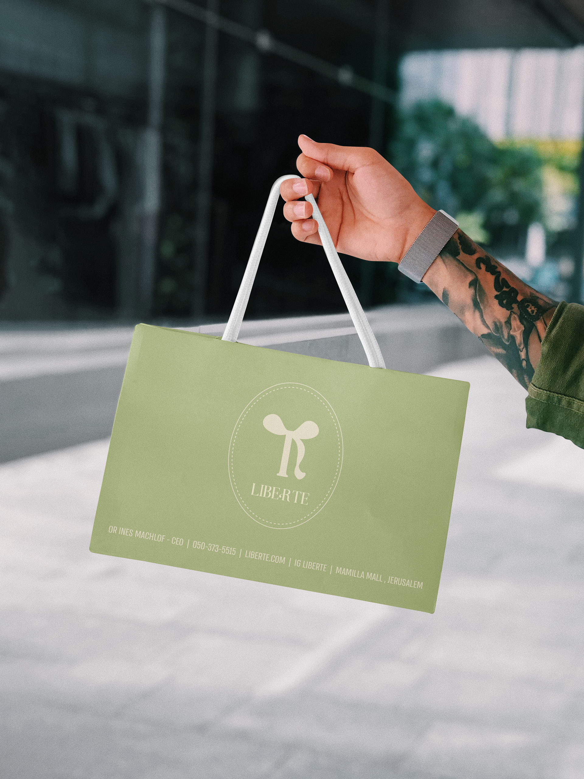
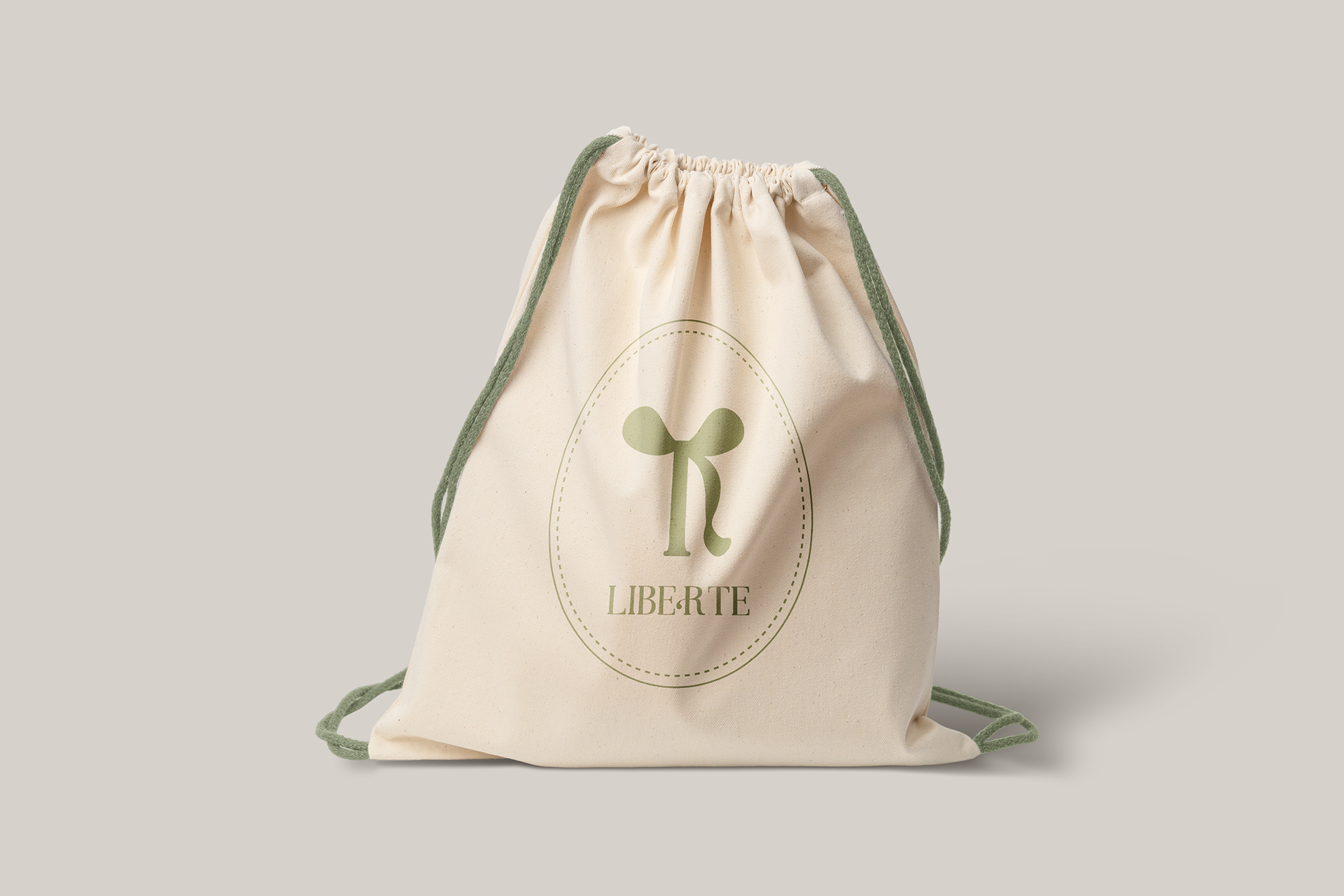
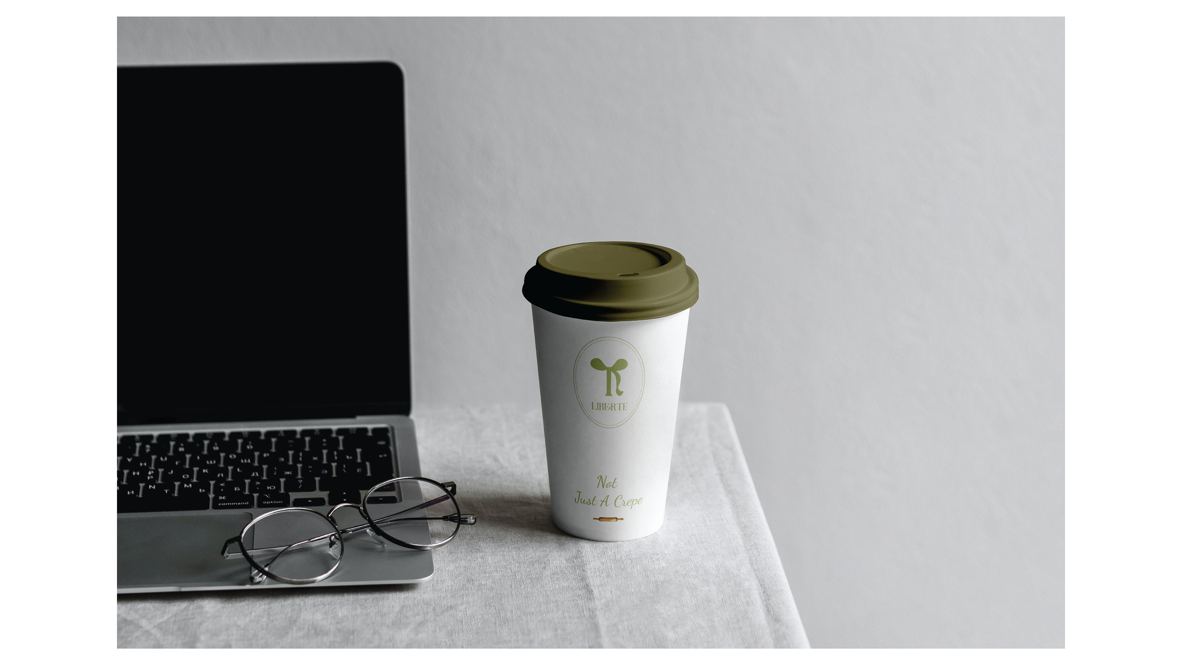
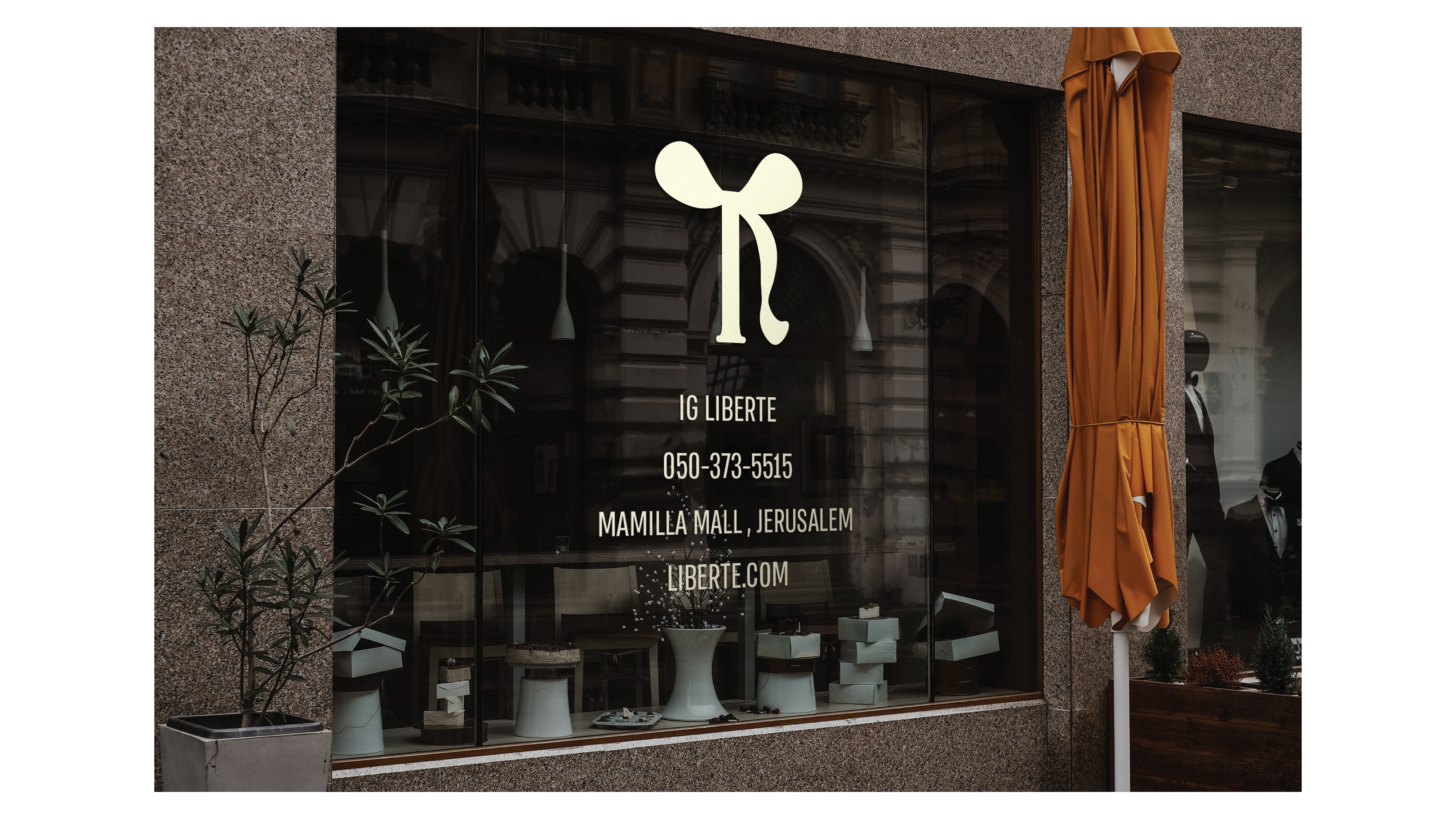
"Liberté" is an elegant French patisserie specializing in the creation of exquisite crêpes with unique flavor combinations, designed to evoke a romantic, sophisticated, and enchanting atmosphere. The name "Liberté," meaning "freedom" in French, was chosen to reflect the brand's core values – freedom of choice, love, and the ability to savor life's small and sweet moments.
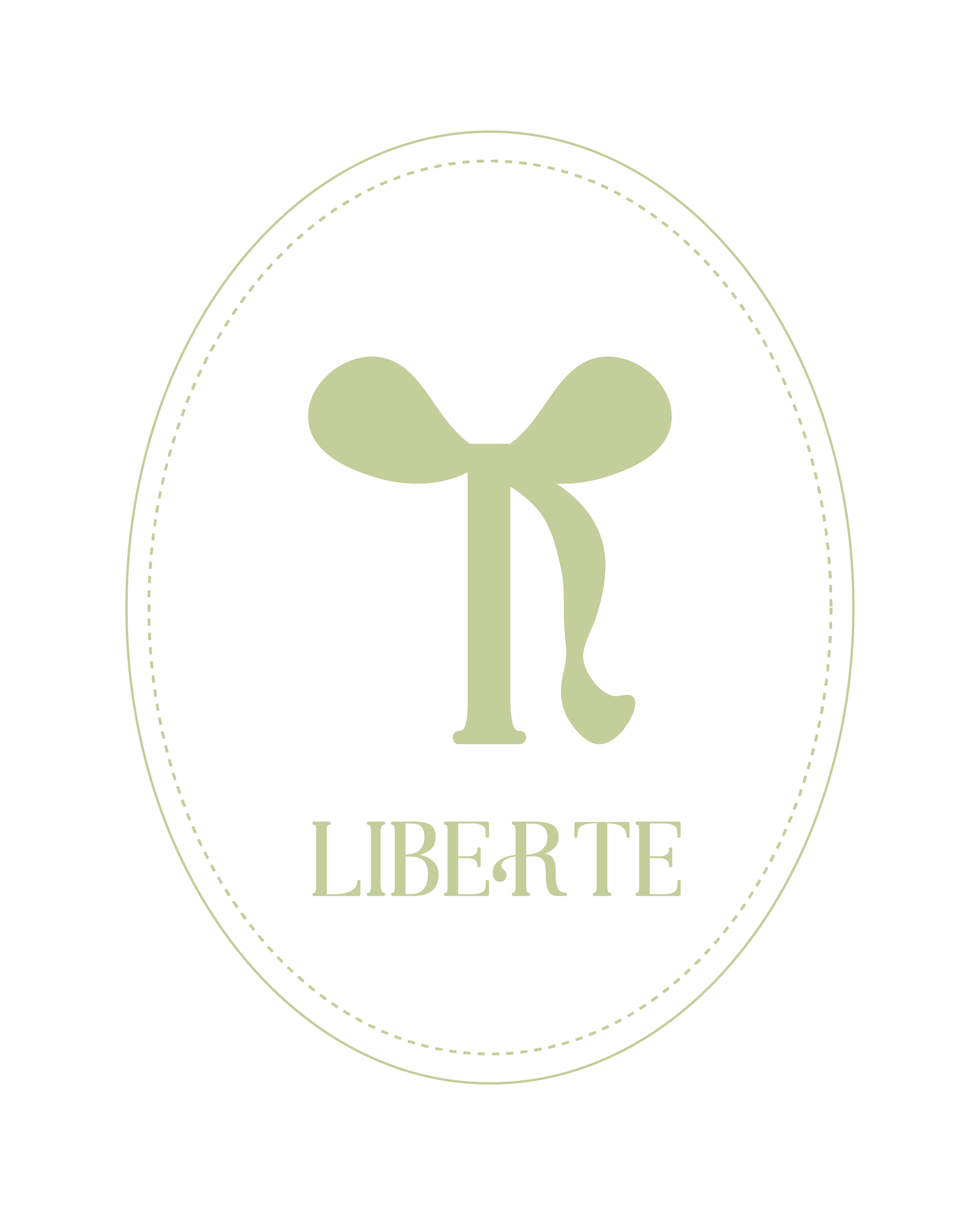
THE LOGO
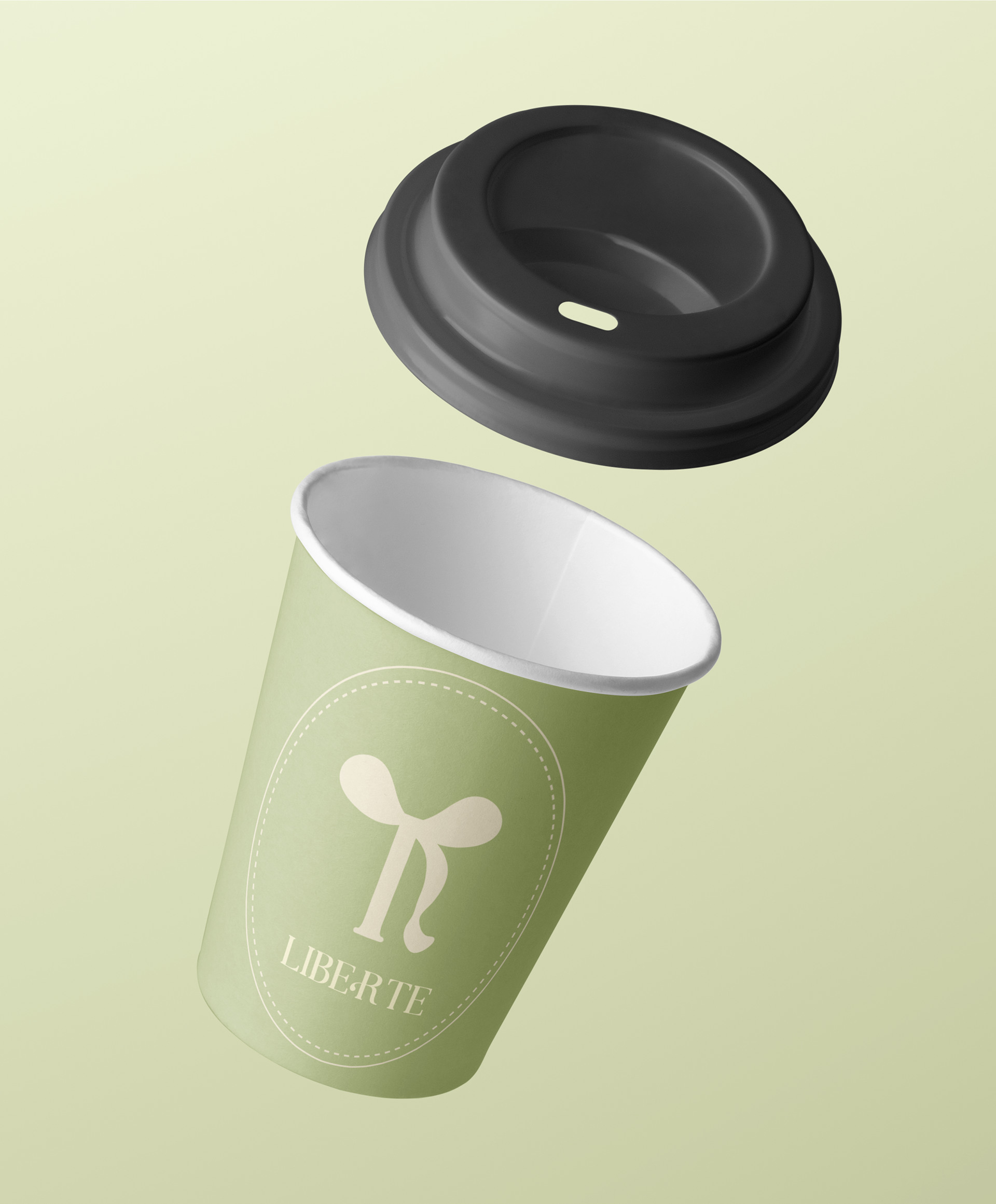
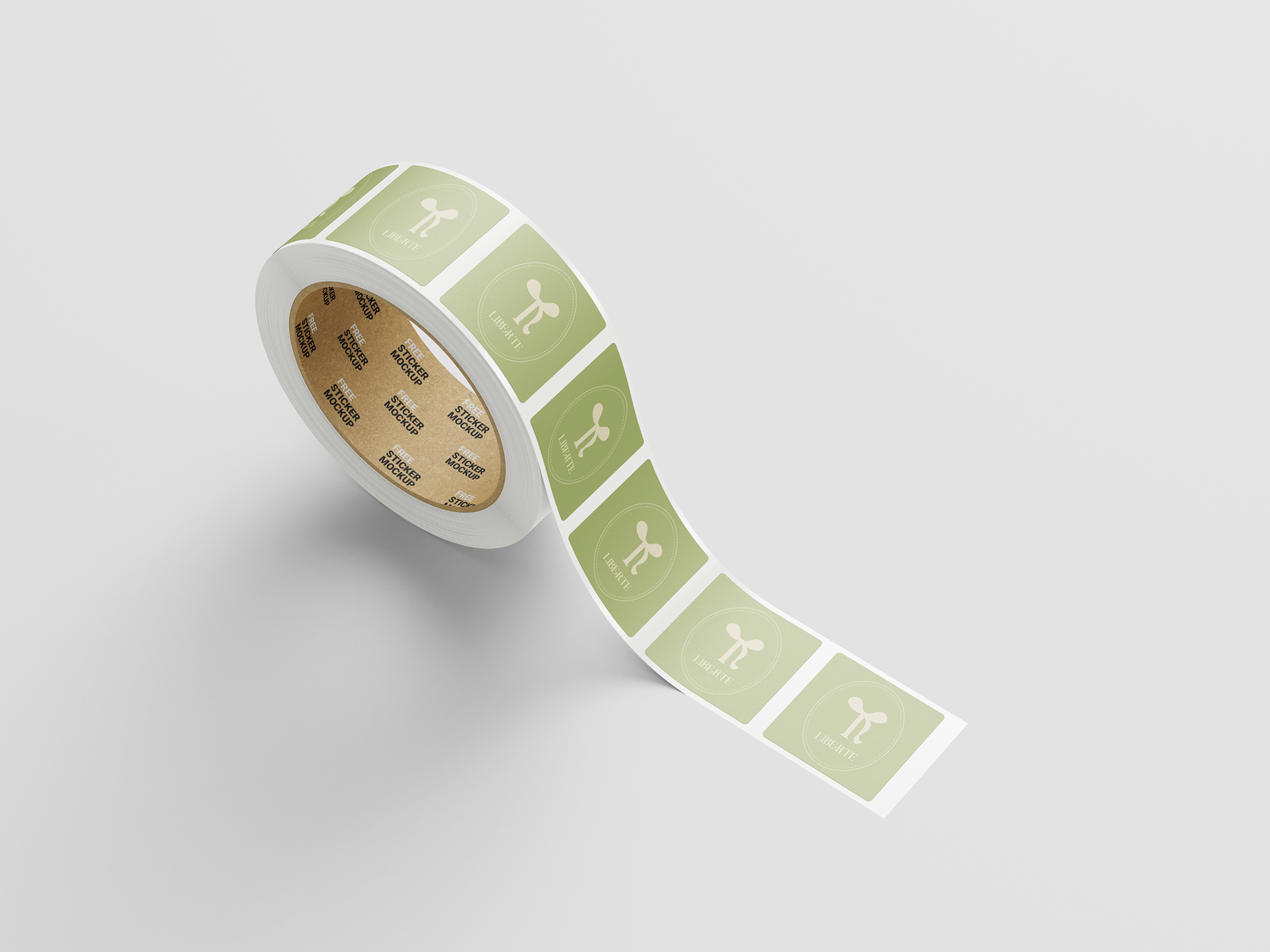
The logo was designed around the letter "R," chosen for its elegant design that balances sophistication and simplicity, inspired by the shape of bows symbolizing romance and delicacy. The bows enhance the composition while highlighting the brand’s values – freedom, love, and luxury. This unique logo invites customers to an unforgettable and enchanting experience.
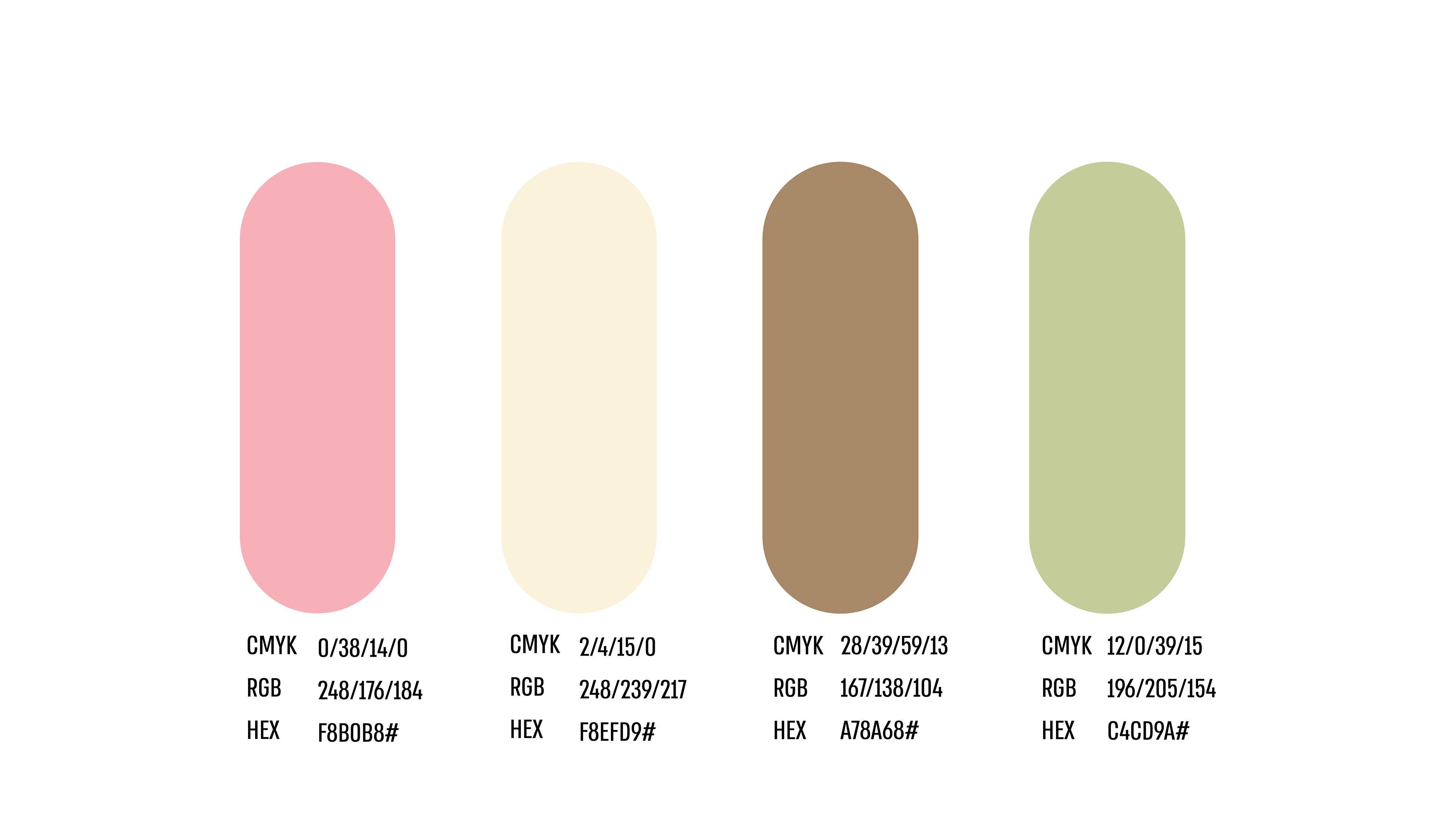
Color Palette
Graphic elements
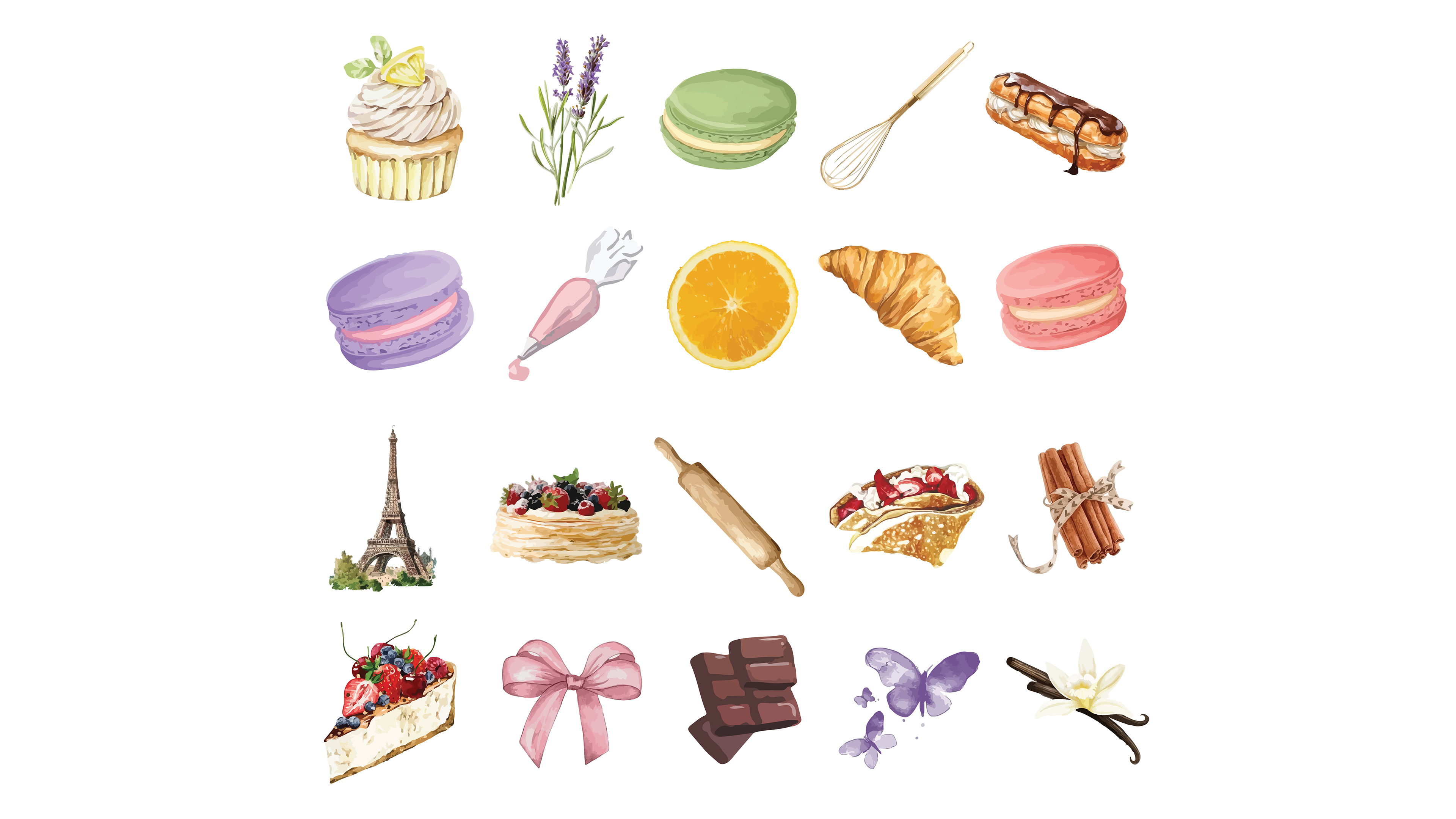
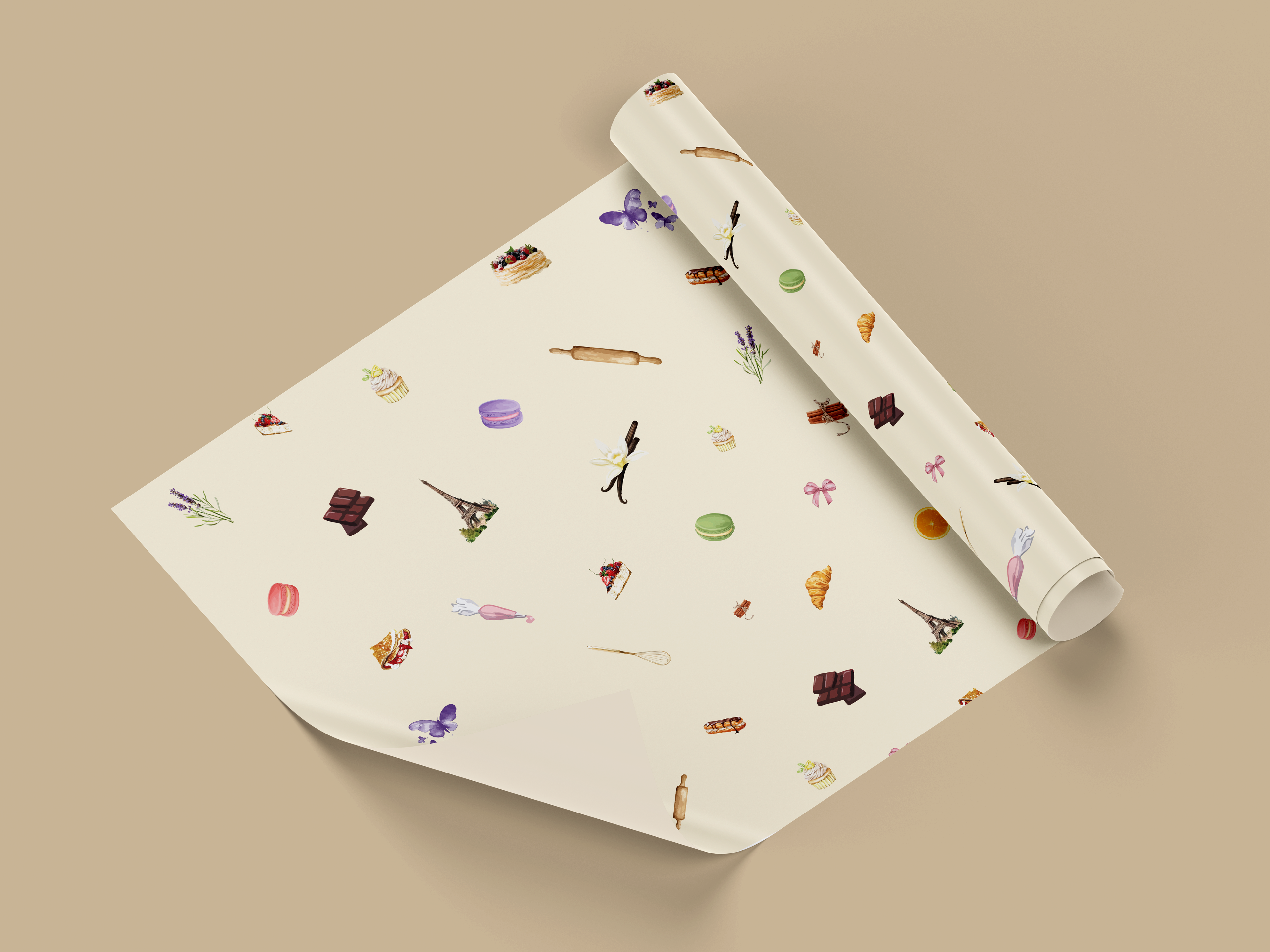
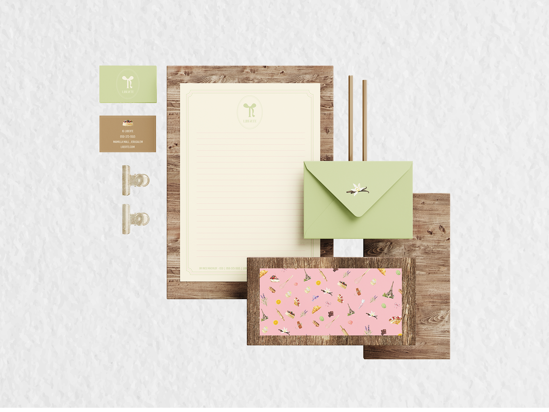
The brand's icons are carefully selected images, uniquely tailored and refined using Illustrator's Image Trace. Any additional icons should match the existing style and color scheme. The repeating pattern is featured on stationery, including envelopes, letterheads, and crepe wrapping paper.
Typography

Products
The project was created as part of my academic studies.